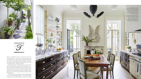
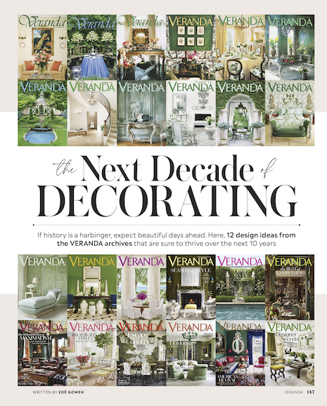
 Veranda is debuting a new redesign. Tile photo (left): Melanie Acevedo. Kitchen photo (right): Werner Straube. Courtesy of Veranda
Hearst shelter publication Veranda is unveiling a redesign for its 35th anniversary, elevating its print magazine with a larger trim size and an expanded page count.
The redesign debuts with Veranda’s May/June 2022 print issue – the title’s largest issue since 2008. In addition to offering a more immersive experience for readers, Veranda is expanding its non-endemic coverage to reinforce its appeal to advertisers in high-end categories such as jewelry and watches, financial services, travel and beauty.
“This was first and foremost our goal: to deliver to our readers more of what they love so much – those immersive visuals backed by substance that have defined the brand for 35 years,” said Steele Marcoux, editor in chief of Veranda.
In this Q&A, Ms. Marcoux and David Hamilton, vice president of sales of the Hearst Design Collection, discuss Veranda’s redesign and the state of luxury print magazines. Here is the dialogue:
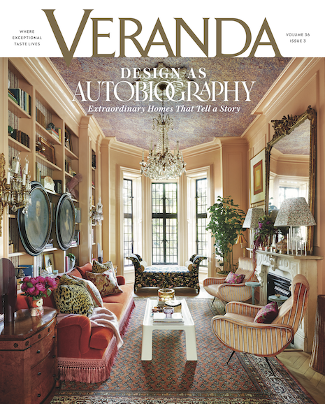
 The May/June 2022 cover of Veranda. Courtesy of Veranda
How did the Veranda team approach this redesign? Did Veranda use reader feedback?
SM: We did incorporate reader feedback. Our loyal and engaged audience was pretty clear with us that they wanted to see more pages, particularly pages with larger images of the houses we feature.
Our aim was to make the magazine a more luxurious, immersive experience and we believe we have achieved this with more pages, a larger format, the new architecture for the magazine, and issues shaped around timeless themes.
In doing so, we are delivering more value to our readers.
It’s unusual to read about print publications increasing their pages in this environment. Why did Veranda feel this was the right strategy?
SM: Adding back pages to the magazine allows us to present our content in the best way possible. One way Veranda has always distinguished itself is by featuring not just well-designed homes, but the art of beautiful living at home.
We do this with stories that showcase entertainment, collections, art, jewelry and travel. But, as our pages declined over the years, the pursuit of those kinds of topics came at the expense of the larger imagery of houses.
Now, we can do both: we can showcase beautiful homes in more spreads, and we can cover non-endemic topics as well.
What is different or stands out from the redesigned magazine?
SM: The re-designed magazine has a new cover template, with fewer lines – really, just one – and the logo set against a white band. The magazine is half an inch wider, and it has at least 40 percent more pages in each issue.
Inside, it’s organized into four main sections, and there are spreads throughout – not just in the home tour section. We still have the same fantastic paper quality only now readers will experience more immersive layouts, with more full-bleed images and spreads.
Is Veranda also adapting its digital strategy to coincide with the print redesign?
SM: Yes, we are. We are working on a homepage redesign that will reflect the new direction in print.
The homepage will be packaged with much more emphasis on visuals, and with content that feels as reflective of our unique point of view as our print product does.
We’re also evolving our strategy slightly to attract an audience and cement our authority through influence rather than scale, so you’ll see much more content that engages our community of design professionals and design enthusiasts in unique and fun ways.
In addition, we’re launching a series of five new digital franchises: Weekend Hop, Style Report, V List, Preserving our Future and Instant Heirloom.
How will Veranda continue to differentiate itself from other high-end shelter publications?
DH: We say that Veranda is “where exceptional taste lives.” Good taste and great style define the title, and we’ll always present the best of the best – no matter the subject – along with deep reporting.
We will continue to appeal to an audience that is obsessed with their homes – not only as showcases of design, but as expressions of their identity and style, the place where they live their lives and entertain their friends.
 Steele Marcoux, editor in chief of Veranda, and David Hamilton, VP sales of the Hearst Design Collection. Image courtesy of Hearst Magazines
Why are you optimistic about the future of luxury print?
DH: Thanks to our experience with Veranda’s highly engaged readership, we know that there is a loyal audience of affluent brand enthusiasts who are willing to pay more for a product they love.
We’ve already seen our average subscription price rise 7 percent in the last audit period, even before introducing these changes. Our approach is to dial up the qualities that readers care about.
We can leverage the unique attributes of print: the visual and tactile experience of lush photography and high-quality paper; the presentation of a variety of topics in one place — where the whole is greater than the sum of its parts; and the enduring value of a magazine that enhances the coffee table or bookshelf for months or years.
Print is indeed a luxury, and we just have to deliver on its promise.
What else should our readers know about the next chapter of Veranda?
SM: As we continue to use our platforms to create and strengthen our community of design professionals and enthusiasts, we’ll be aiming to bring our content to life at bespoke consumer events.
We held our first one in Nashville at a fabulous shop called Reed Smythe the same weekend as the Nashville Antiques & Garden Show and it was a wonderful hit with our audience – equal parts shopping, enrichment, and social is our recipe for success.
Veranda’s May/June print issue goes on newsstands April 26
